
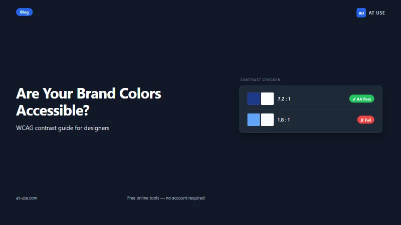
Why accessible brand colors matter — and what happens when they don't
Brand colors start as identity decisions. They're chosen in workshops against moodboards, calibrated for "warmth" or "authority" or "energy." Readability rarely enters the room. Which is why even well-designed palettes frequently fail the people who actually encounter them at scale — on phones in bright sunlight, on low-contrast monitors, or with any degree of age-related or low-vision contrast sensitivity.
The practical cost is real and measurable. A primary button with insufficient contrast against its background doesn't just fail an accessibility audit — it has lower click-through rates. Research from the Web Accessibility Initiative consistently shows that contrast improvements benefit users without disabilities as well: phone users in bright outdoor light, older monitors with washed-out gamma, projectors in conference rooms. "Accessibility fix" almost always means "legibility improvement."
The legal and compliance pressure is also growing. The EU Accessibility Act enforcement began in June 2025, covering digital products and services serving EU customers. In the US, ADA-based web accessibility litigation has hit every major industry vertical. Color contrast is one of the most frequently cited failures in web accessibility audits — and it's one of the easiest to prevent if you check it before your design system is built, not after.
The good news: checking your brand palette for WCAG compliance takes about ten minutes with the right tool. Fixing most palette failures doesn't mean scrapping your colors — it means understanding which shades go where.
WCAG contrast: the two numbers you actually need
WCAG 2.1 Level AA — the accessibility standard referenced by most regulations worldwide — defines color contrast as a ratio between the relative luminance of a foreground color and its background. Luminance is a measure of perceived brightness that accounts for how human eyes weight different wavelengths. The higher the ratio, the more readable the combination.
Two thresholds cover nearly every use case in a brand system:
- 4.5:1 — required for normal-size text (below 18pt regular weight, or below 14pt bold). This is the threshold that catches most brand color problems, because most body text, labels, and button text falls in this category.
- 3:1 — required for large text (18pt or larger, or 14pt bold or larger) AND for UI components: input field borders, button outlines, focus indicators, checkbox borders, icon-only controls without text labels.
To calibrate those numbers against something concrete: pure black (#000000) on pure white (#FFFFFF) achieves 21:1 — the theoretical maximum. A medium grey like #767676 on white achieves exactly 4.5:1, the bare minimum pass for normal text. Many brand colors — particularly warm mid-tones, muted tones, and light pastels — fall below 4.5:1 on white backgrounds without anyone noticing during the design phase.
WCAG 2.2 (the current version) kept the same contrast thresholds from 2.1. WCAG 3.0, still in draft as of mid-2026, proposes a different algorithm called APCA — but it's not a compliance requirement and won't be for some time. For every live project in 2026: design to 4.5:1 for text, 3:1 for large text and UI components.
The full specification is at WCAG 2.1 — Understanding Success Criterion 1.4.3 if you want the formal reading. What you need in practice is a tool that runs the contrast calculation across your full palette so you don't have to do it by hand for every possible color pair.
4-step workflow: checking your brand palette with AT USE
The AT USE Brand Color Checker generates a full contrast matrix for your palette — every foreground/background combination — in a single pass. You see which pairs pass at 4.5:1, which pass only at 3:1 (large text and UI only), and which fail entirely. For a 10-color brand palette, that's up to 90 pairs. This is not practical to check manually.
Step 1 — Collect your hex codes
Open your brand guidelines document or your design token file and pull the hex value for every color in your palette. That includes the obvious ones (your primary, secondary, and accent colors) and the easy-to-forget ones: off-white background tints, light greys used as card backgrounds, dark navy used as an alternative background. If any of those neutrals appear behind your brand-colored text, they belong in the check.
If your brand assets are images rather than a token file, use the AT USE Color Picker to sample colors directly from a screenshot. You get the hex code immediately — no eyedropper and estimated guessing.
Step 2 — Run the contrast matrix
Paste your hex codes into the Brand Color Checker. The tool calculates the WCAG 2.1 contrast ratio for every foreground/background combination and flags each result against both the 4.5:1 and 3:1 thresholds. You see a grid of results showing which pairs are safe for body text, which are safe for large text and UI elements only, and which fail both thresholds.
No installation. No account. The matrix renders in the browser and you can read the results immediately.
Step 3 — Map failures to your actual usage
The matrix shows every possible pair. Your job at this step is to cross-reference against what you're actually using.
Some failing combinations may never appear in your design — your purple and your green icon will never share a text/background relationship. Ignore those. The priority is every pair that exists in your live UI: primary button text on its background color, body text on your card background, link text on your page background, navigation labels on your header. For each failing pair in active use, you have a fix to make.
Work through your component inventory systematically. Button → input → card → nav → modal → tooltip. Document which specific pairings you're using from each component and whether they pass.
Step 4 — Adjust and recheck
When you find a failing pair in active use, you have three options:
- Darken or lighten the foreground color. If your warm coral (#E86B4F) fails on white at 3.2:1, a darkened version like #C54B2F often passes at 4.6:1 while remaining recognizably the same brand color. The eye reads the hue family as consistent even when the shade shifts significantly. Use the AT USE Color Converter to adjust HSL lightness values and get the resulting hex — precise, no guessing.
- Adjust the background instead. A background that's slightly warmer or slightly darker can push a marginal failure into a pass. A warm off-white (#FFF5F0) behind warm coral text has more luminance contrast than pure white does, because the color relationship shifts the relative luminance calculation. This feels counter-intuitive until you run the numbers.
- Restrict the failing pair to non-text use. If a combination fails at 3.4:1, it still works for decorative purposes — background fill, illustrative elements, dividers — as long as no text, icon, or interactive UI component sits on top of it. Document this constraint explicitly in your brand system so future designers don't accidentally place text on it.
After any adjustment, rerun the matrix. The goal isn't maximum contrast everywhere — it's documented confirmation that every text/UI pair in your system meets the threshold for its specific use case.
Common gotchas: where brand audits fail unexpectedly
The obvious failures — light text on a light background — usually get caught. The following patterns are less visible and trip up brand color audits more often.
Interactive states and hover contrast
WCAG 1.4.11 (Non-text Contrast) requires that UI components — buttons, inputs, checkboxes, focus rings — maintain 3:1 contrast between their visual boundary and adjacent background colors. This requirement applies to their default, focus, and hover states independently. All three need to pass, not just the default.
A common failure mode: a primary button passes comfortably in its default state (dark blue background, white text, 8.5:1) but the hover state lightens the blue to a sky shade (#4AAEE0), and the white text ratio drops to 2.8:1. The button text is now failing WCAG AA on hover. Users who navigate via keyboard trigger the hover state regularly via focus. Check every interactive state as its own color pair — not just the visual default.
Theme swaps and dark mode
If your product supports dark mode, your brand palette's contrast relationships can reverse. A color that passes on a white background will frequently fail on a dark background, because it was calibrated for one polarity.
A concrete example: a dark brand navy (#0A1628) on white (#FFFFFF) produces an 18.1:1 ratio — excellent. The same navy used as text on a dark card background (#1A1A2E) produces a 1.2:1 ratio — completely unreadable. If your design token sends the same hex value into both light and dark contexts, the dark-mode case is invisible in a standard contrast check unless you run the matrix against your dark-mode background set separately.
Run the Brand Color Checker twice — once against your light-mode background palette and once against your dark-mode background palette. These are two separate matrices with different failures. Many brand systems need distinct contrast-safe variants for each mode, not a single hex value deployed into both.
Placeholder text and disabled states
WCAG explicitly exempts disabled UI components from contrast requirements — they're decorative indicators of unavailability, not content. Placeholder text, however, is not a disabled state. It's instructional text that helps users understand what to type. It must meet the same 4.5:1 threshold as regular body text.
Browser defaults typically render placeholder text at around 40–50% opacity of the input's text color, which can put it well below 4.5:1. If you've overridden placeholder styling to match a brand color — a light warm grey, a brand-tinted neutral — there's a significant chance it's failing. Check it explicitly: the placeholder color against the input's background color, at the specific opacity or hex value you've defined.
Text on photography and gradient backgrounds
WCAG contrast ratios are point-to-point calculations — one foreground value against one background value. When text sits on a photograph or gradient, there's no single background value. The contrast requirement still applies, but the evaluation has to account for every region of background the text overlaps.
The practical check: identify the lightest region of background your headline overlaps, and the darkest region. Test the text color against both extremes. If the text fails against the lightest region, some of the text is unreadable. The reliable fix is a semi-transparent scrim — a partially opaque dark or light overlay behind the text — which creates a uniform, testable background color. Once the scrim is in place, the contrast check is a simple single-pair calculation again.
For gradients, test the text against the gradient stop where contrast is lowest. This is usually the transition zone, not the ends. Run the check where the palette is most similar in luminance to the text, not where it's most different.
Check your palette before the design system is built
Color contrast issues caught at the brand level cost almost nothing to fix — you're adjusting five hex values in a token file. The same issues caught after your design system ships mean component-by-component remediation: every button shade, every input border, every text-on-card combination, re-evaluated and re-deployed. The gap between "fix the token before you build" and "fix 200 component states after you ship" is real.
The contrast thresholds — 4.5:1 for text, 3:1 for large text and UI components — are not arbitrary. They're calibrated to cover the full range of users with low vision who don't use assistive technology: people navigating on phones in bright outdoor environments, users with contrast sensitivity changes from aging, anyone on hardware with degraded gamma calibration. These users are in your audience. They encounter your brand in the same contexts as everyone else.
WebAIM's Contrast Checker (webaim.org/resources/contrastchecker) is the standard single-pair tool — use it when you know exactly which two colors to check. For a brand palette audit across all your combinations at once, use the AT USE Brand Color Checker to run the full matrix in one pass.
The check takes about two minutes. The record it produces — which pairs pass, which fail, which are restricted to large text only — is useful in design review, in engineering handoff, and in any client conversation about accessibility readiness. It also means the next time someone asks "are our brand colors accessible?" you have an answer that's current, documented, and specific.